Many of our books contains images and graphics. These serve a variety of purposes (maps, photographs, charts). Very often, the images provided by the authors during the initial submission cannot be used. This blog post will shed light on some of the common issues we encounter when dealing with images.
License situation
We can only include graphics for which the book authors have the distribution rights. This is the case if
- the author created the work
- the creator of the work is known and has given it a so-called “free license”
- the creator of the work died more than 70 years ago
- the work was created by the US government
If you do not know who the creator is (e.g. you found the graphic on the Internet) WE CANNOT USE THE IMAGE.
If you wish to reuse a graphic from another publication, you have to ask the original publisher for permission (in most cases). Note that the permission must include “licensed under Creative Commons Attribution license (CC-BY).”
Formats
Images come in two types, raster and vector. Raster images are for instance the well-known jpg and png image formats. These images can be seen as a grid (raster) of width x and height y, where x and y indicate the number of pixels. When zooming in, these pixels can be discerned. In distinction, vector images describe shapes and path, e.g “a circle of diameter 2cm; a straight horizontal line cutting the circle in two halves; a dot of size 3mm at 2/3 of the length of the horizontal line”. Vector images never reveal pixels when zooming in. See the images below for an idea of the difference between vector (above) and raster (below)

The lower half of a circle in a vector program and in a raster program
The problem with pixelated images is that they appear blurry when printed on paper even if they look fine on the screen. In general, raster images should only be used at a resolution of over 300 pixels per inch.
Depending on the type of information which should be represented, one type or the other might be better suited. We will discuss frequent types below:
Photographs:
Use jpg. Make sure the resolution is at least 300 pixel per inch when printed.
Photographs in png format are generally not printable.
Screenshots of programs or websites:
Use png. Do not use jpg, as this will create so-called artefacts. Maximize the window you want to screenshot, using all space you have on your monitors. The size of the window on the screen should be 4 times larger than it will appear on paper. A standard image in our books will have a width of 10cm, so on your screen, the window should be 40 cm wide. If you can manage more, the better.
Screenshots in jpeg format are generally not printable due to artifacts. See screeshots from the wikipedia logo below in png, with clean surfaces, and in jpeg, with blurry surfaces and artefacts.

png: the dark and light areas are only white and only grey.

jpg: the dark and light areas in the jpg image have lots or pixel artefacts.
Note that both images above, regardless of artifacts, would have too low a resolution for being printed.
Plots and charts:
If you create plots with R, export them as svg. If you create plots within a spreadsheet, try to export them as svg, eps, pdf, in that order of preference. Do not screenshot your spreadsheet. See below the difference between a graph created as png and a graph created as vector.

Graph from png (above) and graph from vector (below)
If the data come from a simple table, you can also send us the data and we will create native LaTeX vector plots from the data.
Diagrams, lines; vector (or raw data)
Same as plots
Flow charts:
Export as svg or pdf.
Maps:
Use vector maps. DO NOT SCREENSHOT GOOGLEMAPS. Do not use any maps you find on the Internet, with the exception of OpenStreetMaps. If you send us the coordinates of the map and the features it should have, we can try to produce a vector map over here. See below the difference between a “screenshotted” map and a vector map.
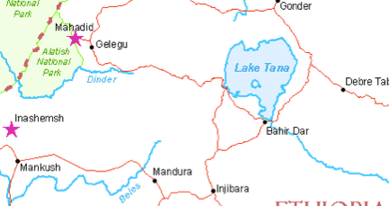
A raster map ((c) SIL 2014)
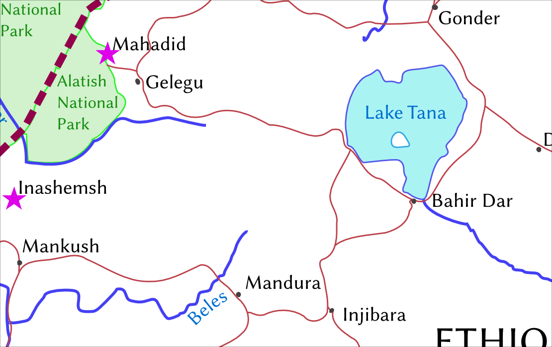
Vector map
Spectrograms
From praat, export as eps. It might be OK to export as png as well. Do not use screenshots.
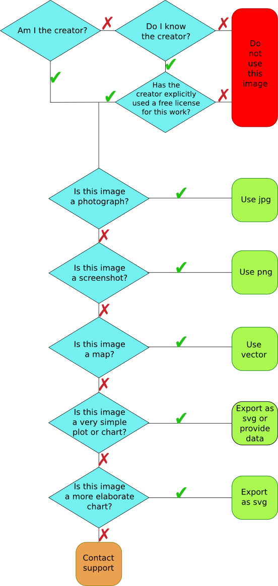
Decision tree
If you are unsure how to proceed, please use the following flow chart:
I am curious as to why the Creative Commons BY (Attribution) license is the only type of CC that is accepted. I’ve had some experience with free content licenses, and I think BY-SA (Attribution-ShareAlike) or even BY-ND (Attribution-NoDerivative) would work just fine. The whole point of BY-SA is ensuring that the derivative work (if any) remains free as well, and apart from that, it’s basically the same license. BY-ND should also work, if the work is to be used as-is. I agree, of course, that BY-NC (Attribution-Noncommercial) would be incompatible for obvious reasons. However, it is my opinion that BY-SA and BY-ND should be included, since their exclusion would amount to the loss of a great deal of free content.
Good point. I have no major objection against SA. The only objection is that when mixing different content later, the license situation becomes somewhat more complicated.
We do not use ND for texts since we want to allow for translations, anthologies etc. For photographs of the artistic type, ND can make sense, but these are not often found in scientific works. For maps, it is less sensible since often you want to recenter the map, add or remove detail etc. ND would prevent this and is thus a bad choice for this case. Diagrams, charts and plots, to the extent that they can be copyrighted in the first place, would not profit from ND either, as colors or legends could not be changed for other use cases as a consequence.
There is thus not a high likelihood that ND will actually ever be the license of choice for graphics in LangSci books.
The requirement for CC-BY above is, if you will, a simplification for expository purposes to avoid discussing all the extra minor license options in detail. Authors are free to make a case for SA or ND if the circumstances require it.
A quick comment to share with other Language Science Press authors additional information that Sebastian Nordhoff kindly sent me by e-mail some time ago.
* Grayscale is good; colour which would also comes out properly as grayscale is good as well. In hardcover, there can be colour pages (which increase the price of the printed book). In softcover, under the current setup the entire volume is in grayscale, so colour pictures that don’t look good in grayscale need to be redrawn.
* If possible, use the same font as the main text (Linux Libertine).
* The type area is 125 mm wide. So the text still needs to be readable if the graphic/image/map is at that size.
* The type area is 184 mm long, but some space is needed for the caption, so not the full length can be used.
I was lucky to receive help from a geographer, Jérôme Picard, who drew the map for ‘my’ book. He greatly appreciated the detailed instructions. Professional cartographers & other design specialists don’t like the lazy instruction ‘just send us everything in JPG’, given by some other publishers — no names will be given here 😉