Linguistic data is often presented in a wide range of glyphs with many modifications on them, such as accents, and from a variety of scripts: á, ô, ẅ, ɖ, ɓ, ð, ʎ. These typographic demands put considerable constraints on font selection. At Language Science Press, we use Libertinus for Latin and Greek base glyphs and modifications.
Our workflow at Language Science Press is built on free and open software (FOSS). Most prominently, we use XeLaTex as a typesetting engine to produce our books. But the fonts we use to typeset our books can be considered FOSS as well. One advantage of using actively maintained FOSS fonts is that improvements to the fonts can be applied in a very short time frame, which enables us to accommodate authors’ needs very quickly.
This blog post is about how particular requirements arising from different books can be accommodated by extending the open Libertinus font.
Coverage as a factor in font selection
Selecting a font can be a complex issue, especially for a scientific publisher in linguistics. For one, font selection is a matter of layout and aesthetics. But there’s also a more technical side to it, and that concerns coverage: it should not be necessary to switch the font for particular glyphs. By offering to publish in a diverse range of sub-disciplines, the fonts for a linguistic publisher must provide all the glyphs needed by those disciplines. For our Studies in Diversity Linguistic series, we need a high coverage not only in Latin base glyphs, but in accents and diacritics as well. On the other hand, our Empirically Oriented Theoretical Morphology and Syntax series depends on typesetting formulas with all sorts of logico-mathematical symbols, such as relations, operators, variables, delimiters, etc.: ①, Σ,→, ⟦…⟧ Additionally, our quantitatively oriented series profit from mathematical type of numbers and equations (as in “p < 0.005”).
Using the same font for all these different use cases achieves a more homogeneous output, which is also easier to read.
For contrast, consider how the last sentence would look like if the matching math font was not used:

There are many fonts that do an excellent job at representing either a wide range of Unicode symbols or formal and mathematical type, but there are not too many that support both. Libertinus, in combination with Libertinus Math, is one of the fonts with a comprehensive approach.
Extending FOSS fonts
The majority of fonts is shipped with a non-permissive license, and they often can’t be edited. Libertinus has the advantage of being an open font. This means that we can modify the inner workings of the font, improve them, and submit our changes to the next official release, which is then distributed to the end user. If you write in LaTeX, Libertinus is also available via your LaTeX installation, be it on Overleaf or on your local computer.
At the time of font selection, it may be hard to predict which glyphs or other font features may be needed in the distant future. That is where a FOSS workflow, together with an active community, really helps. Libertinus is developed on GitHub, currently maintained by Caleb Maclennan. Its sources are editable in FontForge. The community is doing a great job: it is steadily improving Libertinus by providing new glyphs. They adopted our improvements to subsequent Libertinus releases in the past, and they have been helpful in discussing how specific glyphs should look like.
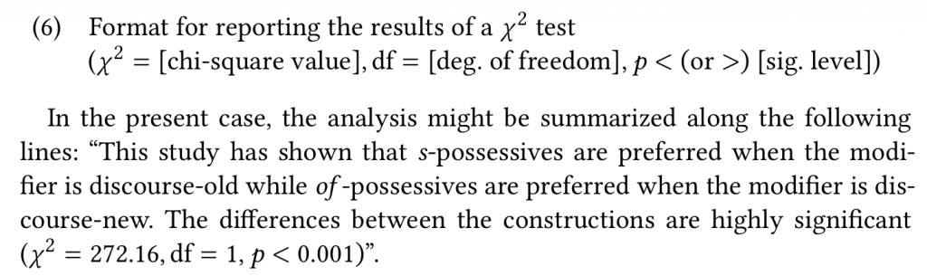
In the production of Nadine Grimm’s Grammar of Gyeli, we stumbled upon the issue that combining accents would not stack very well on other accents. For example, the base glyph a could not be combined with both tilde and circumflex. Due to wrong positioning, the circumflex is not fully visible in the output, and it overlaps with the tilde:
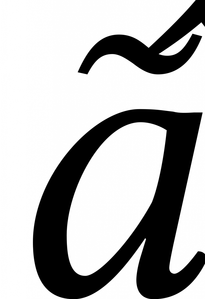
The positioning of accents relative to base glyphs and other accents is controlled by so-called “mark anchors”. The error above occurred because the crucial anchor information was missing in the respective accents. The circumflex diacritic was missing the information where it should be placed relative to a tilde. We added that information with FontForge and pushed the changes upstream. In a few weeks time, they will be available to everyone who’d like to use Libertinus to write Gyeli and other languages that require stacked diacritics.
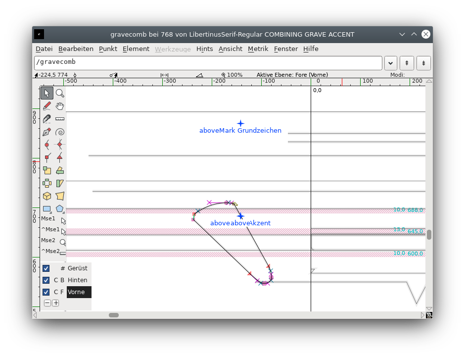
Positioning these anchors at the appropriate coordinates gives a much better result:
The needs of authors differ, of course. Other authors might not need corrections in anchor placements for stacking diacritics, but might need the addition of rare mathematical symbols. An open font like Libertinus allows us to have a very effective workflow to accommodate these diverse needs, and we take pride in the fact that all of the improvements we make to Libertinus are part of a community effort to provide a comprehensive font to everyone.